The most important thing to consider when designing a structure that takes advantage of CSS3 grid to position elements is planning in advance where to place everything.
The beauty of CSS3 grids is that you can have a very different layout on various devices; The first row on desktop can be the last on mobile, without having to modify any of the HTML, duplicating code, or have alternative HTML code for each type of device.
Using @media queries, the browser can be told the structure that should be displayed according to the screen size.
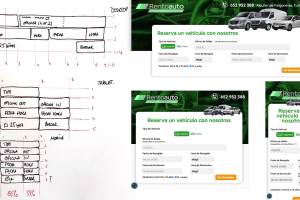
In this project the goal was to create a search form for a car rental company.
I started by designing the structure on paper, knowing that some fields needed more space than others, and that the flow from one field to another was important: You shouldn't go from office selection to vehicle type and then back to another office selection for example.
Once the structure was defined on paper, each row was assigned its "coordinates". (You can also assign a name that the CSS recognizes as a reference.) With these coordinates, it only remained to apply the coordinates to each div in 3 separate media queries.